Archive for the ‘Notes’ category

Share of CO2 emissions by country (2015)

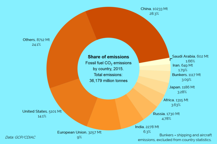
Share of annual carbon emissions

A recent post looked at the growth in emissions among major economic categories since 1960. It’s obvious from this graph that some countries have climbed high on the global emissions ladder. But how high?

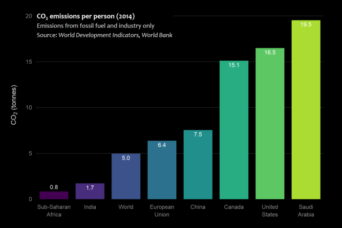
The graph shows the annual emissions of the world’s biggest emitters (fossil fuel emissions only). It used to be that the world’s biggest emitters were all developed countries. Today, five of the ten biggest emitters are in the developing world: China, India, Iran, Saudi Arabia and Indonesia. And of these, China is the absolute largest, releasing more than a quarter of all global CO2 emissions every year. Since its population is so large — around 1.3 billion — its relative emissions are not among the greatest, but its absolute contribution makes China an essential part of any solution to global warming. For comparison, India, with an equally large population, is only responsible for about 6 per cent of emissions. Africa, almost as big, is responsible for less than 4 per cent. Japan, with only a tenth of the population of all of Africa, emits roughly the same. And Saudi Arabia, with a population of less than 30 million, still manages to emit about 1.7 per cent of all global emissions, thanks to its extreme oil dependence. One other slice of the doughnut begs for an explanation: the one labelled “Bunkers”. This counts emissions from international shipping and aviation (which uses what’s called “bunker fuels”), since it can be difficult to determine which country should be responsible (the shipper, the receiver, countries transited through, the flag country?).

CO2 emissions per person (2014)

Worst emission offenders

There is more than one way to count your carbon. One way is to consider the relative CO2 emissions of countries — that is, their emissions divided by their population. This graph isn’t a representation of all the top emitters, but a cross-section pulling out some of the more important countries from top to bottom. It shows a striking differences in carbon dependence.

At the top end of the scale, Saudi Arabia’s economy produces almost 20 tonnes of CO2 of per inhabitant every year. Multiplied by its population, and this country of only 30 million is responsible for more nearly 1.7 per cent of all global emissions. The United States, however, is not far behind, at 16.5 tonnes, and with its population of 330 million, it is also a very large contributor in absolute terms. Canada too is up there among the worst carbon offenders, made possible by its high dependence on oil, gas and coal to fuel its industry, drive its transportation networks and heat homes. Many other notable carbon profligate countries were emitted from this graphic, including countries like Japan, Australia and Russia. The highest emissions per capita in the world actually belong to Qatar, Kuwait and the United Arab Emirates. Qatar’s emission rate is staggering: nearly 40 tonnes of emissions per person per year. And though their populations are small, together they still produce more than 1 per cent of all annual emissions.

In the middle of the scale, the European Union’s emissions of only 6.4 tonnes per inhabitant seems modest in comparison. Even China has surpassed the Europeans, though its large population puts it firmly in first place among the world’s biggest emitters. And at the bottom of the scale, we have Sub-Saharan Africa and India, both with more than 1.2 billion people. Most Africans and Indians go without the things that put the Western world, China and the Arab states high on the list, like home electricity, airconditioning, personal transportation and economies based in part on heavy industry. If they want to acquire these things — as is their right — the rest of the world has an obligation to ensure that they can do it without increasing their emisisons.

Global GHG emissions by sector

Emissions by category

Where exactly do greenhouse gas (GHG) emissions come from? The graph above shows us that they do not necessarily come from the places we might think. Transportation, for example, is the most visible (and pungent) form of carbon pollution in the lives of most people today, so it stands to reason that it’s also responsible for a lot of emissions. Stinking gasoline and diesel fuelled cars and trucks clog our roads and pollute our cities, and oil companies have to shoulder much of the blame for the unfolding climate calamity. But on the global scale, it’s a surprisingly small share of total pollution — only 14% (a different post will look at the distribution in Canada, the US and perhaps the EU).

Read the rest of this entry »

Global CO2 emissions 2017

Emissions up in 2017

After declining in 2016, CO2 emissions went back up in 2017. According to estimates from the Global Carbon Project, emissions increased by almost 600 million tonnes, ending up at 41.47 billion tonnes. Emissions had actually decreased in 2016 after flattening out over the last few years, bringing hope that we had finally reached peak carbon pollution, but it was not to be. Still, emissions have only edged up slightly in five years, so there is hope that the curve will finally start to bend downwards. Just as the curve had flattened mostly because of decreasing coal use in China, the Middle Kingdom was also responsible for the increase, with emissions going up by 3.5%, including 3% growth in coal emissions. China has promised to peak its emissions before 2030, but not quite yet it seems. Let’s hope they do it soon.

Source: The Global Carbon Budget 2017, Le Quéré et al., 2017, pp.33-34 (free download)